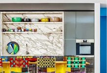
With summer calling for pastel shades, the season’s décor just may leave you craving an instant home makeover with a swipe of a paintbrush. Luckily for homeowners who want to refresh their walls for Summer 2015, Real Style chatted with Sharon Grech, colour consultant for Benjamin Moore Paints in Canada. Grech shares her best tips for the season’s most popular paint shades, colour combinations and the colours that are expected to stay in place for the next few seasons.

Walls: Oxford Gray 2128-40, ben, eggshell Lower Walls: Metropolitan AF-690, Natura, Eggshell
Lower cabinet accent: Blue Hydrangea 2062-60, ADVANCE, Pearl
Upper Cabinet Accent: Guilford Green HC-116, ADVANCE, Pearl
Real Style: Which Summer 2015 paint colour trends do you recommend?
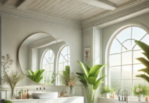
Sharon: The ones that are sort of a summer, and can certainly bleed into other seasons as well and seem to be new are the blush tones. I know we’ve been watching the tones in fashion for a few years, so it was interesting to see how it would translate into the home. We’re looking at the blush tones, and in our 2015 trends, we have a few of the mid tones- a hint of a pink blush tone to a white or even a grey side of the blush tones. Another thing for spring and summer is that blues and greens are still very popular. It’s probably something that’s never going to change, but we’re definitely seeing the whole spectrum, from a blue to the green. Also, a lot of the really pretty blue grass colours that are right in the middle, where we’re not sure if it’s a blue or a green. Whether they’re from a more vibrant, tropical side or down to the pastels and even muted.
Just from accessories, I’ve been seeing a lot of nautical scenes, which works well with a lot of those colours.

Lower Walls: Metropolitan AF-690, Natura,
Upper Wall: Barren Plain 2111-60, Natura, Eggshell
Ceiling: Concord Ivory HC-12, Natura, Flat
Real Style: Are there any colour combinations that you would also recommend?
Sharon: I put together three that I really like for the different stories. The first two are rather light, so on that blue green note. Actually, Benjamin Moore’s Colour of the Year for 2015 is called Guilford Green. It’s a pale green, and it’s fairly light, but it’s a great gray green. So Guilford Green paired with Harbour Fog and Seahorse, which is a yellow but we consider it more on the white side. It’s definitely got a lot of yellow in it, but it’s a nice fresh pastel.
That one sort of shows the gamut of the greens, and I think it can work really well exterior or interior. Also on that soft tone, the blush Soft Sand with a really nice simple white Chantilly Lace and Patriotic White (which is ironically a very pale blue). This is a little bit more on the pastel side but very cool. I tend to think with the summertime especially, we tend to like the cooler colours, so I’ve got a blue in all of these. Then for something a little more edgy and bolder from a colour perspective, I use Blue Danube and combine that with Halo, which is a slightly muted, grey white. With the Blue Danube, it plays off as a very nice white.
Then, accent that with a Split Pea, which is sort of a more acidic, stronger green that we’ve been seeing more of. That again is more of a stronger, fun, more contemporary way of treating a nautical colour scheme. It’s a little more forward for 2015.
Real Style: Which colours are in style now that you also foresee being in style for the next two to three years?
Sharon: A lot of the colours, especially in my world in paint and home décor, we don’t tend to change the colours as drastically as we might with our fashion. The blues and greens, I would say that we’ve been seeing them for a few years now, and I don’t really see any sign of them disappearing. Looking at one of my colleagues, we luck out and get to go to at least one European trade show, like a home furnishings show. My colleague just came back from Milan and we were talking about going through some photographs today, and saw a continuation of a lot of the blues and greens. That was definitely a mainstay, and they get combined a little bit differently. The blues and greens, and how they combine really well with the grey as a neutral, it’s still around and doesn’t really show any signs of disappearing too soon.
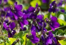
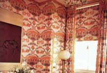
One of the trends that we called out for 2015 is a bit more on the berry side. Funnily enough, when Marsala came out (the Pantone colour), I thought it was interesting because we were a bit more on the purple side and still sort of in that red family. I think those purple tones, rich, sort of saturated colours, are probably going to start again. We’ve been really light for a while, but we’re starting to see things more saturated going into the next couple of years (whether it ends up being more of an accent or we are going to start putting some darker colours on big areas again).
The accent is a bit of influence of black. We like to see black, but maybe for some people it’s too harsh, so we’re going with a purple black or a blue, inky black. That’s the thing. We’ll start and see how it goes into the next few years, but the blues and greens are safe.
Photos: Benjamin Moore


